const spotterEmbed = new SpotterEmbed(document.getElementById('ts-embed'), {
// ...other embed configuration attributes
// Enable the updated Spotter chat prompt experience.
updatedSpotterChatPrompt: true,
});
Customizing the Spotter embed view
- Spotter UI
- Spotter 3 experience
- Spotter Analysts
- Quick search and deep analysis mode
- Spotter starter prompts
- MCP connectors and resource selection icon
- File uploads in Spotter chats
- Spotter icon customization
- Spotter logo and ThoughtSpot branding label
- Styles and interface elements
- Additional resources
When you embed Spotter in your application, you’ll notice that the embedded component loads an initial page with a prompt interface. The look and feel of this page vary depending on the Spotter version used for embedding.
Spotter UI🔗
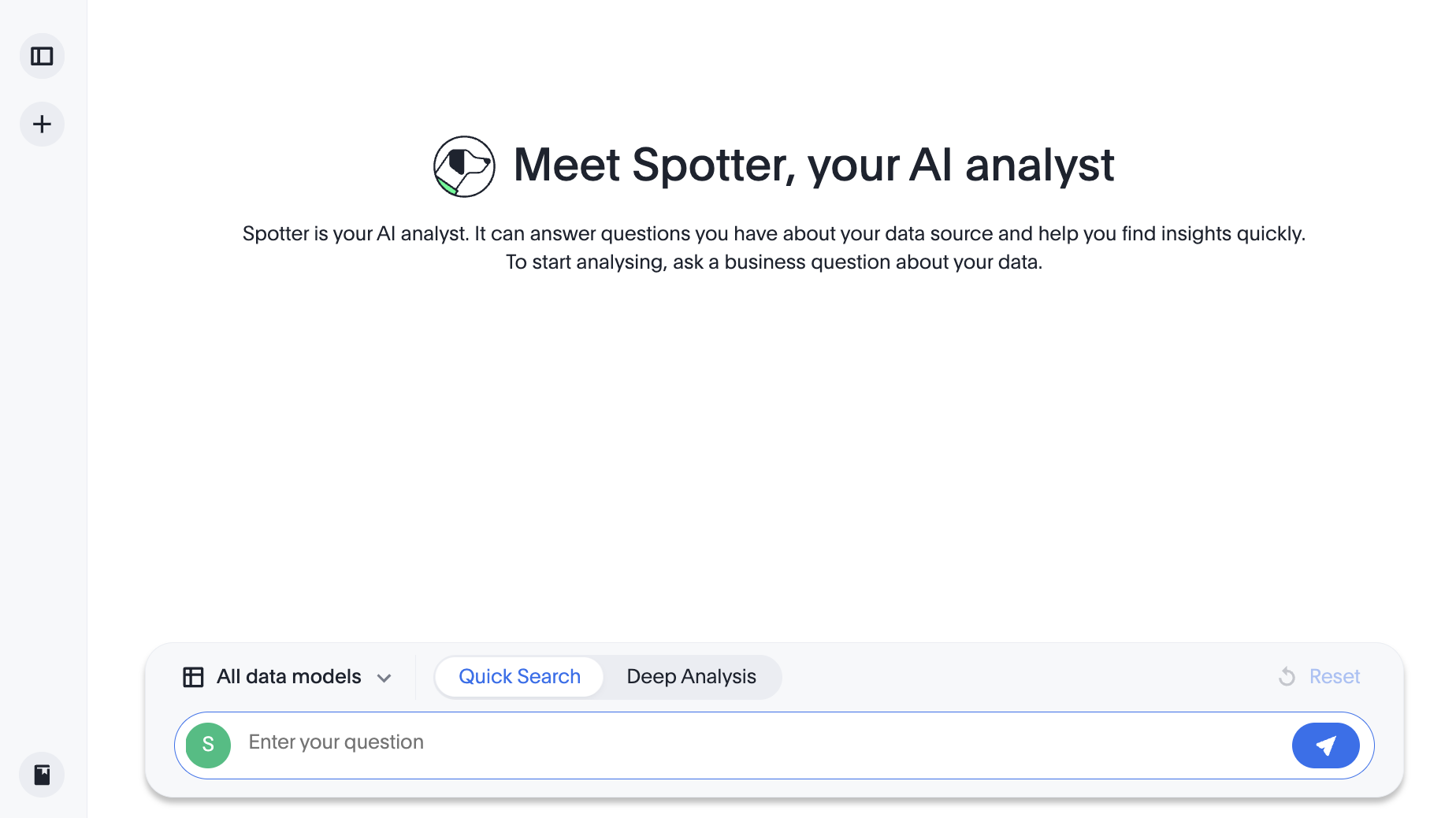
If you have embedded Spotter Classic or Spotter 2, the initial page includes a prompt bar for user input, a data source selector, and the UI options to preview data and reset a Spotter session.
Spotter 3 experience🔗
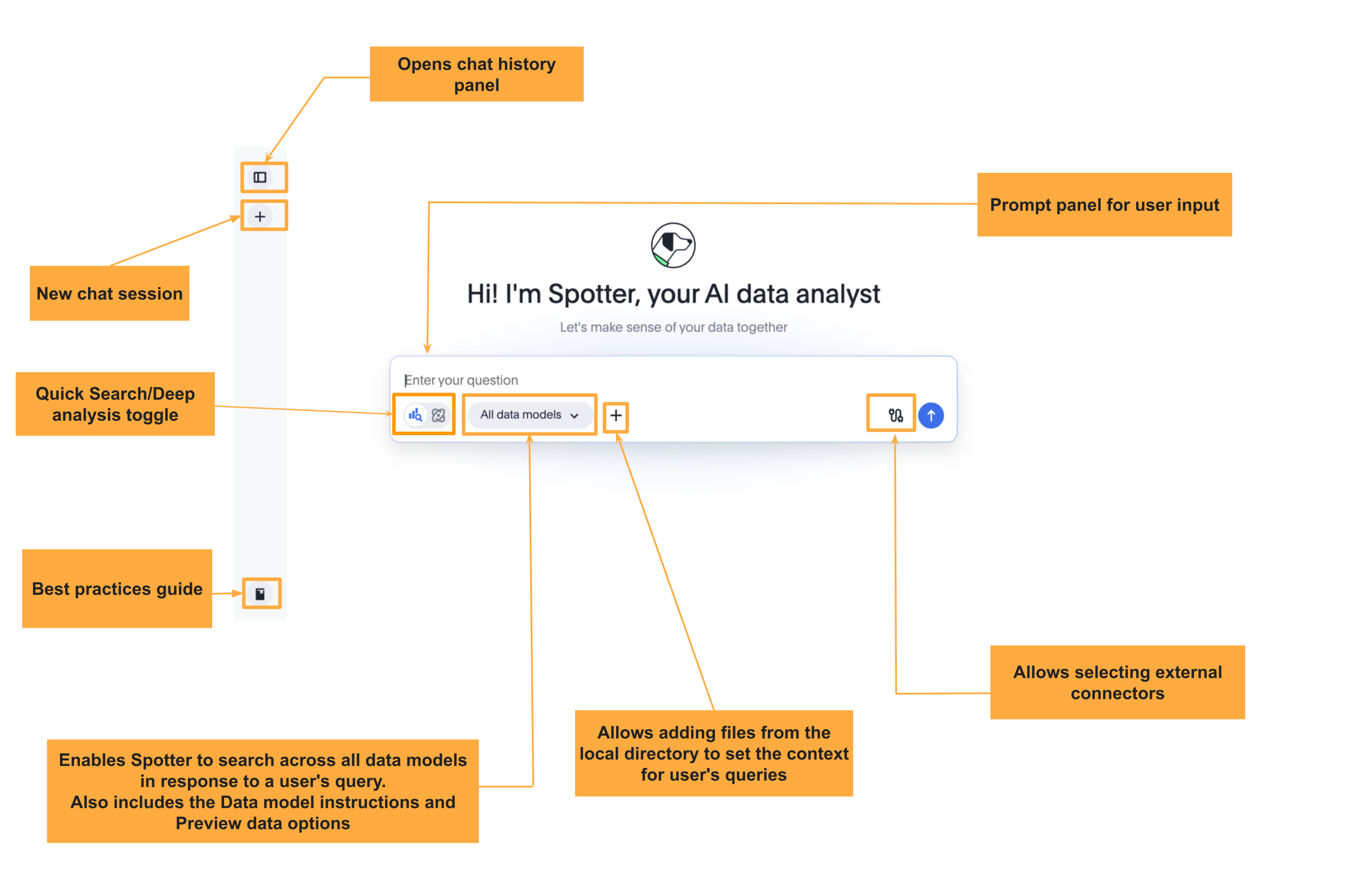
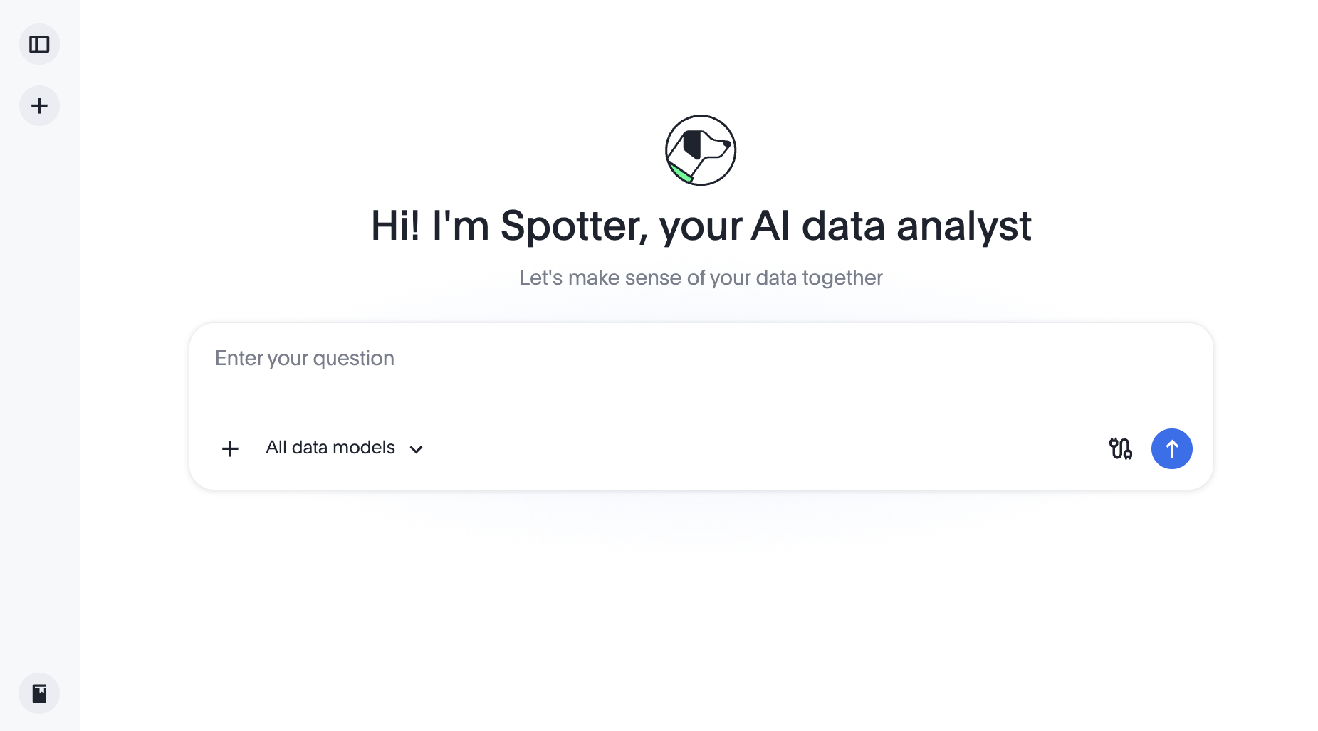
Spotter 3 experience is available with a new prompt interface that includes additional features and user elements to enrich your Spotter experience.
To enable the new chat interface in your embed, set the updatedSpotterChatPrompt attribute:
Spotter classic and Spotter 2🔗
You can load the page with a pre-selected data source or use the Auto mode to allow Spotter to automatically discover and select a relevant data model for user queries.
Default view:
With Auto mode enabled:
|
Note
|
When Auto mode is enabled, Preview data and Data Model instructions options will not be available. |
Chat history panel🔗
You can also include the Chat history panel to allow your users to access the chat history from their previous sessions. To enable and customize the chat history sidebar, configure the chat history properties in the spotterSidebarConfig object:
import {
SpotterEmbed,
SpotterEmbedViewConfig,
SpotterSidebarViewConfig
} from '@thoughtspot/visual-embed-sdk';
const embed = new SpotterEmbed('#tsEmbed', {
// ...other embed view configuration options
// Configuration for the Spotter sidebar UI
spotterSidebarConfig: {
enablePastConversationsSidebar: true, // Enable the chat history sidebar
spotterSidebarDefaultExpanded: true, // Expand the sidebar by default
spotterSidebarTitle: 'Chat History', // Custom sidebar header text
spotterNewChatButtonTitle: 'New Conversation', // Custom label for the New chat button
spotterChatRenameLabel: 'Rename session', // Custom label for the Rename action
spotterChatDeleteLabel: 'Delete session', // Custom label for the Delete action
spotterConversationsBatchSize: 20, // Conversations fetched per batch (default: 30)
spotterDocumentationUrl: 'https://your-help-center-url', // Custom best practices link
},
})
|
Note
|
The standalone |
Spotter Analysts🔗
ThoughtSpot allows users to create and manage AI agents (Analysts) directly within the Spotter interface. These AI agents or bots are referred to as Spotter Analysts. Each Analyst is scoped to a data model and can be configured with custom instructions, personas, and conversation starters.
If you have Spotter Analysts on your ThoughtSpot instance, you can make these available to your embedding application users.
Spotter Analyst panel🔗
If your ThoughtSpot instance has Spotter Analysts, the Spotter Analysts panel and dashboard are visible by default in the Spotter sidebar in the embed view. To control the visibility of this panel in the embed view, use the SpotterAnalystSidebar action ID in the disabledActions, hiddenActions, or visibleActions arrays as needed.
If Spotter Analysts are enabled in the embed view, you can use the following action IDs to show or hide the menu actions:
-
Action.CreateAnalyst
Action ID for the Create new action in the Spotter Analysts page. -
Action.EditAnalyst
Action ID for the Analyst edit option. -
Action.CopyAnalyst
Action ID for the Make a copy action that creates a copy of the Analyst. -
Action.ShareAnalyst
Action ID for the share action that allows sharing an Analyst with other users. -
Action.DeleteAnalyst
Action ID for the delete option.
const spotterEmbed = new SpotterEmbed(document.getElementById('ts-embed'), {
// ...other embed view configuration options
hiddenActions: [
Action.CreateAnalyst,
Action.DeleteAnalyst,
],
});
Analysts label strings🔗
Use spotterAnalystLabel and spotterAnalystsLabel to replace the default "Analyst" and "Analysts" label text in the embedded Spotter interface with custom terminology suited to your application:
const spotterEmbed = new SpotterEmbed(document.getElementById('ts-embed'), {
// ...other embed view configuration options
// Custom label for a single Analyst (default: "Analyst")
spotterAnalystLabel: 'AI Assistant',
// Custom label for the Analysts section heading (default: "Analysts")
spotterAnalystsLabel: 'AI Assistants',
});
Quick search and deep analysis mode🔗
When Spotter 3 experience is enabled on a ThoughtSpot instance, the Spotter interface displays a switcher to toggle between the Quick Search and Deep Analysis modes.
To show, hide, or disable this feature in the embedded view, use the action ID,
Action.SpotterChatModeSwitcher.
const spotterEmbed = new SpotterEmbed(document.getElementById('ts-embed'), {
// ...other embed view configuration options
hiddenActions: [
Action.SpotterChatModeSwitcher,
],
});
Spotter starter prompts🔗
ThoughtSpot allows users to preselect prompts and display these prompts in the Spotter interface for quick analysis. This feature is disabled by default in the embedded view. To enable this feature, contact ThoughtSpot Support.
When this feature is enabled on your instance, you can use the enableStarterPrompts property in the spotterChatConfig object to display the starter prompts to your embedding application users. These prompts appear below the search bar when the users open the Spotter embedded view.
const spotterEmbed = new SpotterEmbed(document.getElementById('ts-embed'), {
// ...other embed view configuration options
spotterChatConfig: {
enableStarterPrompts: true,
},
});
MCP connectors and resource selection icon🔗
If the Spotter 3 interface is enabled, the Spotter page displays the following options to connect external tools and resources for AI analytics.
-
Connector icon that allows you to connect to external applications such as Google Drive, Slack, Notion, Confluence, or Jira, which can be used as a data source in Spotter sessions. These connectors must be preconfigured by your ThoughtSpot administrator for your embedding deployments.
-
Add files (+) icon for uploading files and resources for setting the conversation context.
-
Connectors menu with a
+icon in the prompt panel that lets your application users connect to external tools and resources.
These integrations allow users to include both structured and unstructured data in their conversation sessions.
To show, hide, or disable these options, use the following action IDs in the disabledActions, hiddenActions, or visibleActions arrays as needed:
-
Action.SpotterChatConnectorsfor the Connectors list. -
Action.SpotterChatConnectorResourcesfor the connector resources section.
const spotterEmbed = new SpotterEmbed(document.getElementById('ts-embed'), {
// ...other embed view configuration options
hiddenActions: [
Action.SpotterChatConnectors,
Action.SpotterChatConnectorResources,
],
});
spotterEmbed.render();
File uploads in Spotter chats🔗
To enable file uploads in the Spotter chat panel:
-
Ensure that
spotterFileUploadEnabledis set totruein thespotterChatConfigobject. This setting enables the + Add files option in the Spotter chat panel. -
Optionally, you can restrict the types of files users can upload by specifying the file types in the
spotterFileUploadFileTypesarray. If no file format is specified, all supported file types are allowed for uploads.
const spotterEmbed = new SpotterEmbed(document.getElementById('ts-embed'), {
//...
spotterChatConfig: {
spotterFileUploadEnabled: true,
spotterFileUploadFileTypes: ['pdf', 'png', 'xlsx'],
},
});
Spotter icon customization🔗
To override an icon, you must find the ID of the icon, create an SVG file to replace this icon, and add the SVG hosting URL to your embed customization code. The most common icon to override is the default Spotter icon and its icon ID is rd-icon-spotter.
The following example uses the alternate-spotter-icon.svg file hosted on https://cdn.jsdelivr.net/ to override the Spotter icon.
init({
//...
customizations: {
// Specify the SVG hosting URL to override the icon, for example Spotter (`rd-icon-spotter`) icon
iconSpriteUrl: "https://cdn.jsdelivr.net/gh/thoughtspot/custom-css-demo/alternate-spotter-icon.svg"
}
});
The following figures show the customized Spotter icon:
Spotter logo and ThoughtSpot branding label🔗
To hide the Spotter logo and branding in the chat interface and tool response, use the following SpotterChatViewConfig object properties:
-
hideToolResponseCardBranding
When set totrue, hides the ThoughtSpot logo and icon in tool response cards. The branding label prefix is controlled separately viatoolResponseCardBrandingLabel. -
toolResponseCardBrandingLabel
Custom label to replace theThoughtSpotprefix in tool response cards. Set to an empty string ('') to hide the prefix entirely.- Example
-
import { SpotterEmbed, SpotterEmbedViewConfig, SpotterChatViewConfig } from '@thoughtspot/visual-embed-sdk'; const spotterEmbed = new SpotterEmbed(document.getElementById('ts-embed'), { // ...other embed view configuration options spotterChatConfig: { // Hide the default logo and label on tool response cards in Spotter chat UI hideToolResponseCardBranding: true, // Set a custom label to display as the branding on tool response cards toolResponseCardBrandingLabel: 'CompanyName', }, });
Styles and interface elements🔗
The Visual Embed SDK provides a comprehensive style customization framework for overriding icons, text strings, and the appearance of UI elements.
The customizations object allows you to add custom CSS definitions, replace text strings, and override icons. If your customization framework uses external sources or hosting servers, ensure they are added to the CSP allowlist. For more information, see the CSS customization framework, Customize text strings, and Customize icons sections.
CSS variables for style customization🔗
You can customize the background color of the conversation and prompt panels, button elements, and the components of the charts generated by Spotter using CSS variables.
If Theme Builder is enabled on your ThoughtSpot instance, you can find the variables for Spotter customization by navigating to Develop > Customizations > Theme Builder in the ThoughtSpot UI and downloading the CSS variables.
// Initialize the SDK with CSS variables with custom style definitions
init({
// ...
customizations: {
style: {
// Use CSS variables to customize styles
customCSS: {
variables: {
"--ts-var-button--primary-background": "#008000",
"--ts-var-spotter-prompt-background": "#F0EBFF",
"--ts-var-root-color": "#E3D9FC",
"--ts-var-root-background": "#F7F5FF",
},
},
},
},
});
Text string customization🔗
To replace text strings, you can use the stringIDs and strings properties in the content customization object.
The following example shows how to replace "Spotter" and other text strings on the Spotter interface.
// Initialize the SDK with custom text string replacements
init({
// ...
customizations: {
content: {
// Use the strings object to replace the visible UI text with custom labels.
strings: {
// Change all instances of "Preview data" to "Show data"
"Preview data": "Show data",
// Change all instances of "Spotter" to "dataAnalyzer"
"Spotter": "dataAnalyzer",
}
}
}
});
Menu elements and action visibility🔗
The SDK provides action IDs to disable, show, or hide the following elements and menu actions via disabledActions, visibleActions, or hiddenActions arrays.
For example, you can hide the Preview data, Reset in the prompt panel, or Pin, Download, and other actions from a Spotter-generated response.
The following code sample disables actions and menu elements using the disabledActions array:
// Hide these actions
hiddenActions: [Action.Pin,Action.ResetSpotterChat,Action.DeletePreviousPrompt],
// Disable actions
disabledActions:[Action.PreviewDataSpotter,Action.Edit],
disabledActionReason: "Contact your administrator to enable this feature"
For a comprehensive list of supported actions, see Spotter menu actions.