Preconfigured search questions that guide users by displaying clickable suggestion pills in the Spotter chat interface. Includes the following prompt pills:
-
Quick search
-
Deep Analysis
-
Know your data

You can customize the chat panel and conversational experience using the customization controls available in the SpotterEmbedViewConfig and SpotterChatViewConfig interfaces.
The chat experience in the embedded view varies according to the Spotter experience enabled in your Spotter embed.
| Feature | Description | Availability |
|---|---|---|
Data model selector | Allows users to select a data model to set the context for their Spotter query. Supports setting All data models to let Spotter automatically determine and select the data source. | ✓ Spotter 3 |
Toggle to switch between Quick search and Deep analysis mode | Allows users to switch between the Quick search and Deep analysis mode in the Spotter interface. | ✓ Spotter 3 |
Add files | Allows users to add files from their local directory to provide context for a Spotter query. Available under the + icon in the chat input area. | ✓ Spotter 3 |
Connectors context | Allows users to add external connectors and set context for user queries based on the resources from these connectors. In the new Spotter experience, this option is available under the + icon in the chat panel. | ✓ Spotter 3 |
Spotter starter prompts | Preconfigured search questions that guide users by displaying clickable suggestion pills in the Spotter chat interface. Includes the following prompt pills:
| ✓ Spotter 3 |
To load the Spotter interface with a pre-selected data source, you must specify the data context in the worksheetId attribute. You can specify the GUID of the data model or auto_mode in the worksheetId attribute to enable All data models option so that Spotter can automatically discover and select a relevant data model for user queries.
const spotterEmbed = new SpotterEmbed(document.getElementById('ts-embed'), {
    worksheetId: "auto_mode",
    // ...other embed configuration attributes
});With Spotter 2 and Spotter 3 experience enabled in the embedded view, the Spotter page displays a toggle switch to allow users to switch between the quick search and deep analysis modes.
To show, hide, or disable this feature, use the action ID, Action.SpotterChatModeSwitcher.
const spotterEmbed = new SpotterEmbed(document.getElementById('ts-embed'), {
    // ...other embed view configuration options
    hiddenActions: [
        Action.SpotterChatModeSwitcher,
    ],
});
Spotter starter prompts are preconfigured search questions that guide users when they first interact with Spotter. They provide curated starting points for data exploration by displaying clickable suggestion pills that help users understand what types of questions they can ask about their data. The starter prompts can be found below the prompt panel in the embedded Spotter page.
Starter prompts can be automatically created by ThoughtSpot based on your data model or manually configured by developers to address specific business needs. The prompts are data-model-specific and their content dynamically changes according to the data source content being used by the user for their interaction with Spotter.
When included in the embedded interface, the Spotter page displays the following starter prompts pills:
Quick search
Includes common queries that users frequently ask. These prompts help users get quick answers to standard business questions, such as top products, sales summaries, or regional breakdowns.
Deep analysis
Includes complex analytical questions that require deeper investigation. These prompts guide users toward more sophisticated analysis, such as trend analysis, correlation studies, or root-cause analysis.
Know your data
Users can use this feature to understand the data available to them. This category is useful for onboarding new users or introducing new datasets.
To enable starter prompts in the embedded page, set the enableStarterPrompts property in the spotterChatConfig object to true.
const spotterEmbed = new SpotterEmbed(document.getElementById('ts-embed'), {
    // ...other embed view configuration options
    spotterChatConfig: {
        enableStarterPrompts: true,
    },
});The Add files option is available in the embedded view by default if your embed has Spotter 2 or Spotter 3 experience enabled.
To customize the visibility of the Add files option, use spotterFileUploadEnabled in the spotterChatConfig object.
You can also restrict the types of files users can upload by specifying file format in the spotterFileUploadFileTypes array. If no file format is specified, all supported file types are allowed for uploads.
const spotterEmbed = new SpotterEmbed(document.getElementById('ts-embed'), {
    // ...other embed configuration attributes
    updatedSpotterChatPrompt: true,
    spotterChatConfig: {
       spotterFileUploadEnabled: true,
       spotterFileUploadFileTypes: ['pdf', 'png', 'xlsx'],
    },
});The ability to select external MCP connectors and resources for Spotter AI analytics is available when Spotter 3 experience is enabled in the embedded view. This integration allows your application users to include both structured and unstructured data in their conversation sessions.
The Manage connectors icon in the chat panel allows users to select external connectors such as Google Drive, Slack, Notion, Confluence, Web search or Jira, as a data sources in their Spotter sessions. This list displays only the connectors that are preconfigured by the ThoughtSpot administrator.
To show, hide, or disable the Manage connectors option, use the Action.SpotterChatConnectors action ID in the hiddenActions or disabledActions array.
const spotterEmbed = new SpotterEmbed(document.getElementById('ts-embed'), {
    // ...other embed view configuration options
    updatedSpotterChatPrompt: true,
    hiddenActions: [
        Action.SpotterChatConnectors
    ],
});
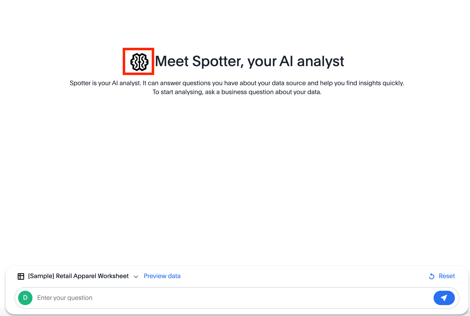
spotterEmbed.render();To override an icon, you must find the ID of the icon, create an SVG file to replace this icon, and add the SVG hosting URL to your embed customization code. The most common icon to override is the default Spotter icon and its icon ID is rd-icon-spotter.
The following example uses the alternate-spotter-icon.svg file hosted on https://cdn.jsdelivr.net/ to override the Spotter icon.
 init({
     //...
     customizations: {
    // Specify the SVG hosting URL to override the icon, for example Spotter (`rd-icon-spotter`) icon
         iconSpriteUrl: "https://cdn.jsdelivr.net/gh/thoughtspot/custom-css-demo/alternate-spotter-icon.svg"
     }
 });
The following figures show the customized Spotter icon:
To hide the Spotter logo and branding in the chat interface and tool response, use the following SpotterChatViewConfig object properties:
hideToolResponseCardBranding
When set to true, hides the ThoughtSpot logo and icon in tool response cards. The branding label prefix is controlled separately via toolResponseCardBrandingLabel.
toolResponseCardBrandingLabel
Custom label to replace the ThoughtSpot prefix in tool response cards. Set to an empty string ('') to hide the prefix entirely.
import {
    SpotterEmbed,
    SpotterEmbedViewConfig,
    SpotterChatViewConfig
} from '@thoughtspot/visual-embed-sdk';

const spotterEmbed = new SpotterEmbed(document.getElementById('ts-embed'), {
    // ...other embed view configuration options
    spotterChatConfig: {
        // Hide the default logo and label on tool response cards in Spotter chat UI
        hideToolResponseCardBranding: true,
        // Set a custom label to display as the branding on tool response cards
        toolResponseCardBrandingLabel: 'CompanyName',
    },
});