// Import ThoughtSpot SDK
import {
    init,
    LiveboardEmbed,
    Action,
    RuntimeFilterOp,
    EmbedEvent,
    AuthType,
    HostEvent
} from "@thoughtspot/visual-embed-sdk";
import "./styles.css";
import {
    getTokenService
} from "./tokenService";

// Use prefetch to load static resources early and optimize response time.
// Call init early to complete authentication during app load for better performance.
init({
   thoughtSpotHost:
   /*param-start-hosturl*/"https://embed-1-do-not-delete.thoughtspotstaging.cloud" /*param-end-hosturl*/,
   /*param-start-styleCustomization*//*param-end-styleCustomization*/
    authType: AuthType.TrustedAuthTokenCookieless,
    getAuthToken: getTokenService,
    disableTokenVerification: true,
});

// Instantiate class for embedding a Liveboard
const embed = new LiveboardEmbed("#your-own-div", {
    frameParams: {},
    /*param-start-liveboardId*/liveboardId: "d084c256-e284-4fc4-b80c-111cb606449a" /*param-end-liveboardId*/
    /*param-start-activeTabId*//*param-end-activeTabId*/
    /*param-start-liveboardFullHeight*//*param-end-liveboardFullHeight*/
    /*param-start-customizeLiveboardHeader*//*param-end-customizeLiveboardHeader*/
    /*param-start-hideLiveboardHeader*//*param-end-hideLiveboardHeader*/
    /*param-start-runtimeFiltersAndParameters*//*param-end-runtimeFiltersAndParameters*/
    /*param-start-modifyActions*//*param-end-modifyActions*/
});

hideNoDataImage();
showErrorBanner('none');

embed
    // Register event listeners
    .on(EmbedEvent.Init, showLoader)
    .on(EmbedEvent.Load, hideLoader)
    /*param-start-customActionHandle*//*param-end-customActionHandle*/
    .on(EmbedEvent.Error, (error) => {
        if (error?.data?.errorType === 'FULLSCREEN') {
            showErrorBanner('none');
        } else
        if (typeof(error.error) === 'string') {
            showErrorBanner('flex', error.error);
        } else {
            showErrorBanner('flex');
        }
        console.log('Error ', error);
        hideLoader();
    })
    // Render Liveboard
.render();Style customization tutorial
One of the main advantages of ThoughtSpot Embedded is the control over the styling and UI elements provided by the Visual Embed SDK.
This tutorial provides a walkthrough of customizable elements of ThoughtSpot UI and essential steps to style your embedded ThoughtSpot content.
ThoughtSpot allows customizing the following aspects of its UI:
-
Large component elements
-
CSS styles
-
Text strings and icon replacement
-
Menu items
01 - Getting started🔗
This tutorial uses the Visual Embed SDK Playground built into every ThoughtSpot instance to demonstrate various customizations in a live environment.
We suggest copying the code into a text editor or IDE such as Visual Studio Code to make it easier to work on the examples, and then copy the values back into the code editor within the Playground.
To get started:
-
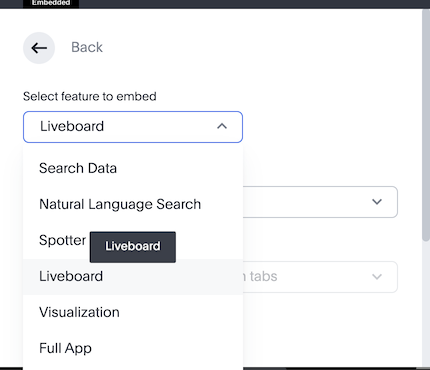
Select the
Liveboardcomponent to embed in the Playground:
-
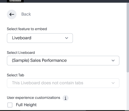
Select the (Sample) Sales Performance Liveboard, which should be available on all instances, including the Free Trial setup.

-
If you do not have "(Sample) Sales Performance" available, use any Liveboard that you have access to.
You should see the following code in the code panel of the Playground page.
-
Copy at any point down to
.render();:
02 - Large component elements🔗
The checkboxes above the code panel provide quick access to the code to customize embedded elements.
-
Click Customize Liveboard header checkbox. You’ll see the following code block in the code editor:
 /* Show or hide the liveboard title and description */
 showLiveboardTitle: true,
 showLiveboardDescription: true,
 // isLiveboardHeaderSticky: false, /* Removes the header stickiness when scrolling if set to false */
 // hideLiveboardHeader: true, /* Hides the entire liveboard header */

 /* Customize display of tabs in the liveboard header */
 // hideTabPanel: true, /* Removes the tab panel */
 // visibleTabs:['TabId'], /* Remove all tabs if empty array*/
 // hiddenTabs:['TabId'],
 /* Use either visibleTabs or hiddenTabs */
If the Customize Liveboard header checkbox is unavailable on your instance of ThoughtSpot, check Full Height then copy the code above over the
fullHeight: truesection that is added to the Code Editor.NoteThe code includes examples of several settings that are commented out using the
//line comment. Removing//enables these settings and allows you to include them in your code. -
Click Run. The
LiveboardEmbedcomponent loads with the new options. -
Remove
//before thehideLiveboardHeader: trueproperty to enable this setting. -
Click Run again to see the updated results.
Available options for component element customization🔗
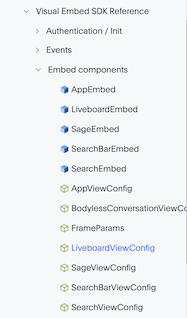
There are many more configurations available for each component than those available in the Playground. To see all available options, see Embed Classes and Embed Interfaces.

To use a setting that is not automatically generated by the Playground, go to its definition within the reference page and look at the example code.
To override user’s locale settings:
-
Click locale.
-
Copy the property into the code in the Playground and specify a valid locale attribute. For example,
frorit:/* We added this one ourselves */ locale: 'fr', /* Show or hide the Liveboard title and description */ showLiveboardTitle: true, showLiveboardDescription: true, // isLiveboardHeaderSticky: false, /* Removes the header stickiness when scrolling if set to false */ // hideLiveboardHeader: true, /* Hides the entire liveboard header */ /* Customize display of tabs in the liveboard header */ // hideTabPanel: true, /* Removes the tab panel */ // visibleTabs:['TabId'], /* Remove all tabs if empty array*/ // hiddenTabs:['TabId'], /* Use either visibleTabs or hiddenTabs */ -
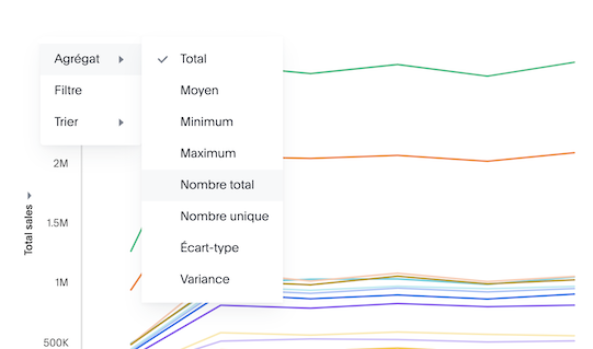
Click Run and try some of the items in the menu system when the Liveboard loads.

Hiding elements without configuration options🔗
If there are elements of the page that you can’t find an option to hide in the embedded interface configuration options, you may need to use the CSS customization framework to hide a given element directly.
If your implementation requires hiding certain elements, let ThoughtSpot know the element for which you need a configuration option by submitting an idea to the ThoughtSpot Community.
03 - CSS styles🔗
The Visual Embed SDK has a customizations framework for adding CSS and other overrides.
In the Playground, select the Apply custom styles checkbox. The code panel shows a large block of code with various options for CSS customization:
|
Note
|
The |
customizations: {
    style: {
        customCSSUrl: "https://cdn.jsdelivr.net/gh/thoughtspot/custom-css-demo/css-variables.css", // location of your style sheet

        // To apply overrides for your style sheet in this init, provide variable values below, eg
        customCSS: {
            variables: {
                "--ts-var-button--secondary-background": "#F0EBFF",
                "--ts-var-button--secondary--hover-background": "#E3D9FC",
                "--ts-var-root-background": "#F7F5FF",
            },
        },
    },
},
Variables and selectors🔗
ThoughtSpot provides many pre-defined CSS variables to control the styling of the embedded component UI and its elements.
The style definitions can all be declared directly within the variables block of the customCSS code.
The customization framework also allows using any CSS selector to target specific elements with changes that do not have a defined variable. Selectors can be declared within the rules_UNSTABLE block inside customCSS. However, selectors may change with new releases as elements of ThoughtSpot are updated.
Let’s add a selector to the code in our Playground. First, comment out the customCSSUrl line, then add the rules_UNSTABLE block below variables:
customizations: {
    style: {
        // customCSSUrl: "https://cdn.jsdelivr.net/gh/thoughtspot/custom-css-demo/css-variables.css", // location of your style sheet

        // To apply overrides for your style sheet in this init, provide variable values below, eg
        customCSS: {
            variables: {
                "--ts-var-button--secondary-background": "#F0EBFF",
                "--ts-var-button--secondary--hover-background": "#E3D9FC",
                "--ts-var-root-background": "#F7F5FF",
            },
            rules_UNSTABLE: {

            }
        },
    },
},
Variables declare a single property, therefore are defined as "{var-name}" : "{value}", whereas selectors allow you to assign several properties to the selected elements.
|
Note
|
Selectors apply properties to elements with many layers of styling. Always add |
One use case of the rules_UNSTABLE section is @font-face declarations, which have many properties for one selector.
We’ll switch the main font to Poppins, available from Google Fonts:
-
Add the
--ts-var-root-font-familyvariable to declare the new font.
Note that you’ll need to use this exact name value in@font-facedeclarations. -
Add a selector block within the
rules_UNSTABLEblock. -
Include font declarations.
// ...
 customCSS: {
     variables: {
         "--ts-var-button--secondary-background": "#F0EBFF",
         "--ts-var-button--secondary--hover-background": "#E3D9FC",
         "--ts-var-root-background": "#F7F5FF",
         "--ts-var-root-font-family": "Poppins"
     },
     rules_UNSTABLE: {
         '/* ff-400 */ @font-face': {
             'font-family': "Poppins",
             'font-style': 'normal',
             'font-weight': '400',
             'font-display': 'swap',
             'src': "url(https://fonts.gstatic.com/s/poppins/v21/pxiEyp8kv8JHgFVrJJfecnFHGPc.woff2) format('woff2')"
         }
     }
 },
Notice the format shows the selector as the key, then an object block containing individual key-value pairs for the properties. Because the selector is an object key, but all
@font-facedeclarations start the same way, we add a unique CSS comment at the beginning to allow for multiple@font-facedeclarations. -
Click Run.
-
Notice the Liveboard reload with the
Poppinsfont for most of the text.
CSS files🔗
You can collect a set of variables and selectors into a CSS file, rather than declaring them in the JavaScript code block. CSS files can be included from any domain, but they must be added to the CSP style-src domains and CSP font-src domains on the Develop > Customizations → Security settings page.
Both https://cdn.jsdelivr.net and https://fonts.gstatic.com sites are automatically added to ThoughtSpot’s CSP allowlist.
In your CSS file, the global variables must be declared in the :root { } block, while @font-face declarations of a named font can be placed anywhere:
:root {
  --ts-var-button--primary-background: #2359B6;
  --ts-var-button--primary--hover-background: blue;
  --ts-var-button--primary--font-family: Poppins,Helvetica,Arial,sans-serif;;
}

@font-face {
  font-family: 'Poppins';
  font-style: normal;
  font-weight: 400;
  font-display: swap;
  src: url(https://fonts.gstatic.com/s/poppins/v21/pxiEyp8kv8JHgFVrJJfecnFHGPc.woff2) format('woff2');
}

.bk-filter-option {
  display: none!important;
}
Hide elements🔗
As seen in the CSS file example above, one of the use cases for selectors is to hide embed component elements that do not have a configuration option.
display: none!important is the most typical property to accomplish this, but you may choose any CSS rule that causes the desired effect.
Make sure that the selector you use is specific and does not affect other elements that you don’t intend to hide.
If you have been hiding certain elements via CSS selectors, contact ThoughtSpot to request configuration options for such elements, so that the overall configurations can be expanded over time. Similarly, provide feedback on properties that variables are unavailable by submitting an idea to the ThoughtSpot Community.
04 - Text strings and icon replacement🔗
The customizations object allows replacing replace specific text strings and icons.
Replace text strings🔗
Let’s add the content property above the style property in the customizations code and then add the strings property block within this code. Now we can declare the exact text elements to replace within ThoughtSpot:
// ...
customizations: {
    content: {
        strings: {
            "Liveboard": "Dashboard",
            "SpotIQ": "Insights",
            "Spotter": "AI Agent"
        }
    },
    style: {
        ...
    },
},
Replace icon sprites🔗
Icon sprite replacement requires creating a file of SVG icon definitions, the format for which is available in the icon sprite customization documentation. After you have the SVG file saved and accessible to ThoughtSpot, add the iconSpriteUrl property in the customizations block:
// ...
customizations: {
    iconSpriteUrl: "https://cdn.jsdelivr.net/gh/thoughtspot/custom-css-demo/icon-override1.svg",
    content: {
        strings: {
            "Liveboard": "Dashboard",
            "SpotIQ": "Insights",
            "Spotter": "AI Agent"
        }
    },
    style: {
        ...
    },
},
05 - Menu items🔗
ThoughtSpot menus are accessible in the top right corner with the ellipsis icon (…) or via a right-click on a chart axis or data point. The … menu is referred to as the More options menu.
On Liveboards, a top menu for the Liveboard and a separate menu for each visualization is available. The menu from right-clicking a data point is referred to as the Context menu.
Hiding or disabling items🔗
Individual menu items are controlled by their capabilities and are referred to as Actions. The Visual Embed SDK reference guide for Actions contains a complete list of named capabilities.
In the Playground, select the checkbox for Modify available actions. You’ll see the following code in the code editor:
  disabledActions: [],
  disabledActionReason: "Reason for disabling",
  // visibleActions: [], /* Removes all actions if empty array */
  hiddenActions: [],
  /* Use either visibleActions or hiddenActions */
If you want to show only a small set of selected menu items, use visibleActions (an allowlist) and comment out hiddenActions (a deny list).
Let’s show only the DownloadAsPdf action:
  disabledActions: [],
  disabledActionReason: "Reason for disabling",
  visibleActions: [Action.DownloadAsPdf], /* Removes all actions if empty array */
  //hiddenActions: [],
  /* Use either visibleActions or hiddenActions */
When you click Run, the Liveboard reloads with only a single menu item in the More options menu as specified in the visibleActions array.
|
Note
|
The above example also hides the right-click context menu items, including the Drill down action ( |
The disabledActions array keeps the item in the menu but grays it out, and shows disabledActionReason when hovering over the disabled action.
Triggering hidden menu items with HostEvents🔗
ThoughtSpot Visual Embed SDK defines two types of events:
-
EmbedEvents - to listen to actions within ThoughtSpot components
-
HostEvents - to send messages to the ThoughtSpot components from the embedding application.
If a menu item has been hidden, you can still send in a HostEvent to cause the same behavior.
In the Playground, select the Use Host Event checkbox. You’ll see the following code block in the code editor:
 document.getElementById('tryBtn').addEventListener('click', e => {
      // Trigger events can be added here to bind to try button click!
      // eg use the Reload Event so that clicking on "Try event" button reloads the embed:
      embed.trigger(HostEvent.Reload);
 });
The above code block adds a click event to the Try Event button above the preview panel in the Playground. Clicking Try Event triggers the HostEvent.
Let’s replace the default Reload event with DownloadAsPdf:
 document.getElementById('tryBtn').addEventListener('click', e => {
     // Trigger events can be added here to bind to try button click!
     // eg use the Reload Event so that clicking on "Try event" button reloads the embed:
     embed.trigger(HostEvent.DownloadAsPdf);
 });
Testing this requires the following steps:
-
Click Run to reload the embedded component.
-
Click Try Event.
You should see the PDF export modal dialog button pop up within the embedded component area.
If you do not want the modal dialog to appear, you could instead use the ThoughtSpot REST API to accomplish the task either within the browser or in a back-end process. This allows for choosing vastly different behaviors than those allowed by the ThoughtSpot modal dialogs.
Adding new menu items with custom actions🔗
ThoughtSpot allows you to add new items called custom actions to the menu system, either to the More options menu on a given visualization of a Liveboard or the context menu that appears when a single point is right-clicked.
The Callback custom actions require a three-part setup:
-
Define the custom action within ThoughtSpot, with a particular id.
-
Assign the custom action to the visualization.
-
Add the
EmbedEvent.CustomActionlistener within the Visual Embed SDK code.
To try it out, select the Handle custom actions checkbox. You’ll see the following code block in the code editor:
 .on(EmbedEvent.CustomAction, payload => {
     const customActionId = 'insert Custom Action ID here';
     if (payload.id === customActionId || payload.data.id === customActionId) {
         console.log('Custom Action event:', payload.data);
     }
 })
Some EmbedEvents such as VizPointClick fire off without involving the menu system and function similarly to context menu custom action.
06 - Conclusion🔗
This tutorial has covered how to customize the UI and UX of ThoughtSpot’s embedded components, but only within the Visual Embed SDK Playground.
The next steps are to move this code into your application page and configure the CSP and CORS settings for your application’s test environments, so you begin integrating ThoughtSpot directly into your application.