
Customize Liveboard layout and UI
Table of Contents
The LiveboardViewConfig object includes several properties that control the look and layout of an embedded Liveboard, such as the header, tabs, tile spacing, responsive layout, and grouping and styling of tiles.
Before you begin, make sure you have embedded a Liveboard using the LiveboardEmbed component.
Show/hide large UI elements🔗
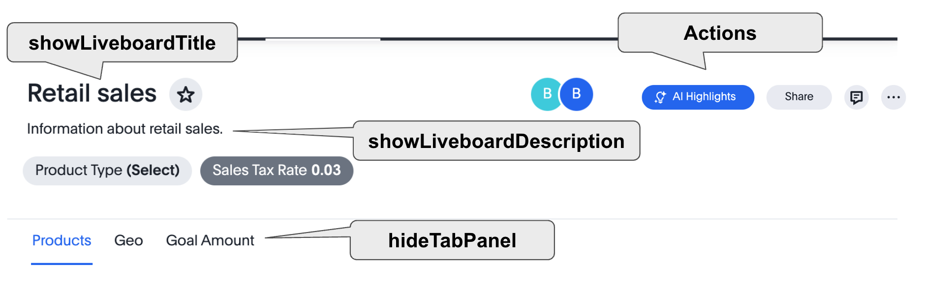
Parameters such as hideLiveboardHeader, hideTabPanel, isLiveboardHeaderSticky, showLiveboardTitle, and showLiveboardDescription control various aspects of the standard embedded Liveboard experience. Note the phrasing of the property name and the description in the documentation to understand whether true enables or disables the particular feature.
The hideLiveboardHeader property removes the entire header area above the Liveboard, including filters and the overall Liveboard menu, which is a common pattern for "read-only" use cases or for rebuilding your own menus and buttons using HostEvents.
const embed = new LiveboardEmbed('#embed', {
  ... // other liveboard view config
  hideLiveboardHeader:true,
});
When the header is hidden, you can trigger filter interactions programmatically using host events. For more information, see Updating filters.
The following constructor disables the sticky header and shows the Liveboard title, which is hidden by default:
const liveboardEmbed = new LiveboardEmbed(document.getElementById('ts-embed'), {
    frameParams: {
        width: '100%',
        height: '100%',
    },
    isLiveboardHeaderSticky : false,
    showLiveboardTitle: true,
    liveboardId: '<%=liveboardGUID%>',
});|
Note
|
When |
Enable compact Liveboard header🔗
By default, embedded Liveboards display a full-height header bar that contains the Liveboard title, description, filter chips, tab navigation, and action menu. You can switch to a more space-efficient layout by enabling the compact header.
The compact header reduces the vertical footprint of the header area, integrates tabs and filter chips into a single condensed row, and moves the Edit button into the header’s overflow action menu.
To enable the compact header, set isLiveboardCompactHeaderEnabled to true in the LiveboardViewConfig object. Note that the isLiveboardCompactHeaderEnabled attribute is set to true by default on all ThoughtSpot embedded instances using Visual Embed SDK v1.51.0 or later.
const liveboardEmbed = new LiveboardEmbed(document.getElementById('ts-embed'), {
    //... other embed config properties
    isLiveboardCompactHeaderEnabled: true,
});
When isLiveboardCompactHeaderEnabled is true, the following UI changes apply compared to the standard header:
| Area | Change |
|---|---|
Header height | The header renders in a condensed, shorter height to maximize the visible content area. |
Edit button | The Edit button is removed from the top-level header and is accessible from the header overflow (…) menu. |
Filter chips | Filter chips are rendered inside the compact header’s integrated filter row, replacing the separate floating filter panel. |
Tabs | The tab bar is incorporated into the compact header row, rather than appearing as a separate element below the header. |
Sticky scroll behavior | The scroll threshold at which the sticky header attaches to the top of the viewport is recalculated for the compact header’s shorter height. This may affect the scroll position at which the header becomes sticky compared to the standard header. |
Hiding the Liveboard title in compact header🔗
In the compact header, you can hide the Liveboard title by setting showLiveboardTitle to false in the LiveboardViewConfig object:
const liveboardEmbed = new LiveboardEmbed(document.getElementById('ts-embed'), {
    //... other embed config properties
    isLiveboardCompactHeaderEnabled: true,
    showLiveboardTitle: false,
});
To hide filter chips that are not relevant to the active tab in the compact header, see Customizing filter visibility.
Customize Liveboard tabs🔗
By default, the first tab created on a Liveboard is set as the home tab. You can set any tab as an active tab using the activeTabId property in the Visual Embed SDK as shown in the example here:
const liveboardEmbed = new LiveboardEmbed(document.getElementById('ts-embed'), {
    frameParams: {
        width: '100%',
        height: '100%',
    },
    liveboardId: "d7a5a08e-a1f7-4850-aeb7-0764692855b8",
    activeTabId: "05406350-44ce-488e-abc5-5e8cdd65cf3c",
});|
Note
|
The |
Reduce visible tabs and visualizations🔗
visibleVizs and visibleTabs allow you to limit the experience for certain users on a Liveboard with many more elements.
For example, a template Liveboard with many different key performance indicators (KPIs) could be reduced to a smaller set by giving a user an interface to select the particular visualizations to show, storing their selections, and using that saved set of visualization globally unique identifiers (GUIDs) as the array for visibleVizs on page load (there is an equivalent HostEvent called SetVisibleVizs to make an update after the Liveboard has loaded).
Add Note tiles🔗
You can add a Liveboard Note tile with custom text, images, and links on an embedded Liveboard.
-
Only users with edit access to a Liveboard can add a Note tile.
-
Users require
Can upload dataprivilege to upload an image to the note tile. -
If you are adding links and images from an external site, or embedding multimedia or a web page in an iFrame, make sure the URLs are added to CORS and CSP allowlists. For more information, see Security settings.
Liveboard grouping and styling🔗
You can now create a visual group of Answers and note tiles together in the Liveboard. You can select multiple Answers and notes in the Liveboard editor. You can also style parts of the Liveboard, groups and Answers with the new styling panel.
To enable this feature, set isLiveboardMasterpiecesEnabled to true.
Note the following changes that occur in the Liveboard UI and layout when this feature is enabled.
-
All tiles on the Liveboard now have a default border and an increased border-radius, resulting in more pronounced curved corners. This is part of the broader visualization tile customization options to enhance the visual appearance of charts and tables.
-
For Note tiles, the default scrollbar is now hidden for long content. Users must scroll within the tile area itself, and if the tile is not sized appropriately for its content, it may appear clipped due to the new container styles. This change emphasizes the importance of sizing Note tiles correctly to avoid content being visually cut off.
-
If a Liveboard is saved with Groups in the ThoughtSpot interface, but the embedding code does not have the grouping and styling feature enabled, the Liveboard fails to load and returns an error.

To embed a Liveboard that uses Groups, you must set
isLiveboardMasterpiecesEnabledtotruein your embedding configuration. This is required for compatibility with the new grouping and styling features; otherwise, the embedded Liveboard does not render correctly.
For more information, see Liveboard grouping and styling.
For information about the CSS variables for this feature, see CSS variables reference.
Set Liveboard tile gutter🔗
The liveboardGutter property lets you control the spacing between Liveboard tiles and groups, and the grid’s outer layout padding, directly from your embed configuration. The value you set overrides the Liveboard’s saved styling setting.
Use this property when you need to enforce consistent tile spacing across embedded Liveboards, regardless of how individual Liveboards are styled in ThoughtSpot.
const liveboardEmbed = new LiveboardEmbed(document.getElementById('ts-embed'), {
    frameParams: {
        width: '100%',
        height: '100%',
    },
    liveboardId: '<%=liveboardGUID%>',
    liveboardGutter: 16,
});
liveboardEmbed.render();
The following rules apply to the liveboardGutter value:
-
Accepts non-negative integers (0 or greater).
-
A value of
0removes all gutter space between tiles and the grid’s outer layout padding. -
Negative numbers, decimal values, and non-numeric strings are ignored. The Liveboard falls back to its saved styling value.
|
Note
|
The Liveboard header’s horizontal margin is controlled separately by the |
Redefine Liveboard breakpoint widths🔗
The enable2ColumnLayout property, when enabled, allows you to customize the Liveboard breakpoint width for embedded users.
The current 12 column layout changes to 2 columns per row at 1024px, and to 1 column per row layout at 630px in the new Liveboard experience. Once enabled, these breakpoints apply to all Liveboards in the ThoughtSpot instance, and cannot be set only for individual Liveboards.
These breakpoint widths are customizable for the embedded customers. Contact ThoughtSpot support for assistance with customization.
12-column layout in embedded Liveboards🔗
By default, embedded Liveboards use a responsive layout that collapses from 12 columns to 2 columns at container widths of 1024px or less, and to a single column at 630px or less.
Use the isLiveboardAlwaysOn12ColLayout property in the SDK to prevent this collapse and keep the
12-column layout at all container widths.
To force the 12-column layout, set isLiveboardAlwaysOn12ColLayout to true in the
LiveboardViewConfig object:
const liveboardEmbed = new LiveboardEmbed(document.getElementById('ts-embed'), {
    frameParams: {
        width: '100%',
        height: '100%',
    },
    liveboardId: '<%=liveboardGUID%>',
    isLiveboardAlwaysOn12ColLayout: true,
});
The property is also supported on AppEmbed via AppViewConfig:
const appEmbed = new AppEmbed(document.getElementById('ts-embed'), {
    frameParams: {
        width: '100%',
        height: '100%',
    },
    isLiveboardAlwaysOn12ColLayout: true,
});|
Note
|
The CSS variables |