
SpotterViz AI agent in Liveboards
Table of Contents
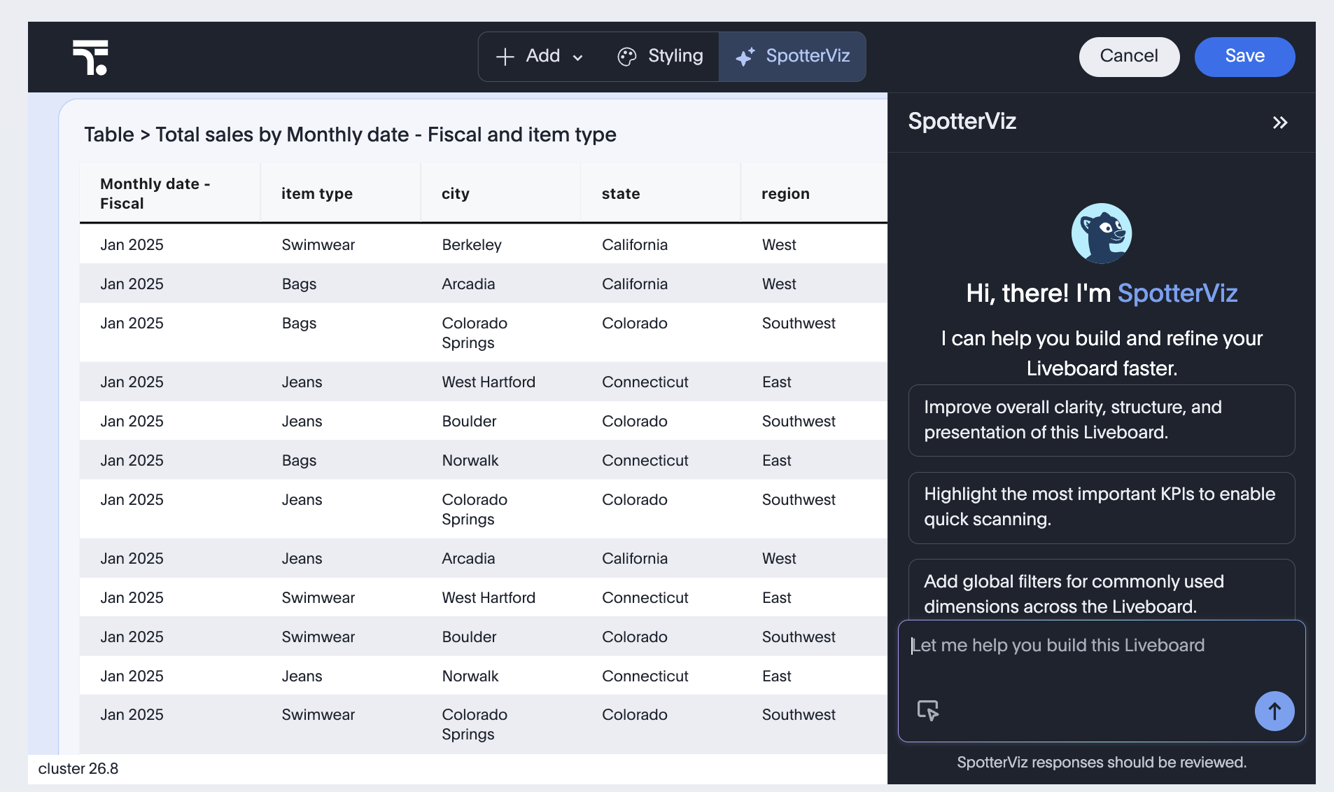
ThoughtSpot SpotterViz is an AI-powered analysis panel that appears when a user opens the Liveboard in edit mode. It provides Liveboard users with an in-context AI assistant and a prompt interface to ask questions on Liveboard data and receive automatically generated visualizations and insights in response.
|
Note
|
SpotterViz is disabled by default on ThoughtSpot instances. To enable this feature on your instance, contact ThoughtSpot Support. |
Accessing SpotterViz panel🔗
If the SpotterViz feature is enabled on the instance, the panel is displayed by default when a Liveboard is opened in the edit mode in the embedded view.
To disable or hide SpotterViz in embedded view, use the Action.SpotterViz action ID in the disabledActions or hiddenActions array.
Customizing the SpotterViz panel contents🔗
For SpotterViz panel customization, pass the spotterViz configuration object with the following properties as needed:
- Brand name
-
To replace the default SpotterViz label with your product or assistant name, specify the brand name string in
brandName. - Greeting headline
-
Customize the greeting prefix displayed before the brand name using
brandHeadline. For example, settingbrandHeadline: "Hi there! I’m"combined withbrandName: "Dashboard Builder"renders as "Hi there! I’m Dashboard Builder". - Description
-
Use
descriptionto include your custom description text below the greeting. This helps users understand what the AI assistant can do. - Input placeholder
-
Use
inputChatPlaceholderto customize the placeholder text shown in the chat input box when it is empty. By default, this text is displayed as "Let me help you build this Liveboard". - Loading state headline
-
Use
loaderHeadlineto replace the default headline text shown in the SpotterViz panel when it is generating a Liveboard in response to a user prompt. Use this property to display a custom message that matches your application’s tone. For example, Crunching the numbers, Building your dashboard, and other such text. - Loading state tips
-
Use
loaderTipsto replace the default tips shown alongside the loading state with a custom list. Each tip is defined using theSpotterVizLoaderTipinterface with the following attributes:-
label. String. Short label rendered alongside the tip text, for example,'Tip'. -
text. String. Tip body text shown to the user while the Liveboard is loading. Use this to guide users with context-specific hints, such as Try asking about revenue by region.If you set
loaderTipsto an empty array, no tips will be displayed.
-
- Starter prompts
-
SpotterViz displays the question suggestions in the panel to help users begin an AI-assisted analysis. Each prompt has a short display label (
displayText) and a full prompt string (fullPrompt) sent to Spotter when clicked.-
To hide starter prompts, set
hideStarterPromptstotrue. -
To customize the starter prompt text, use
customStarterPrompts. ThecustomStarterPromptsincludes the following attributes:-
id. String. Unique identifier for the prompt within thecustomStarterPromptsarray. We recommend setting the ID to values such as'1','2', and'3'. -
displayText. String. Short label shown to the user as a clickable suggestion chip. -
fullPrompt. String. Full prompt text sent to Spotter when the user clicks the suggestion.For example, you can set the display text as
displayText: 'Regional breakdown'andfullPrompttoShow me revenue broken down by region.
-
-
- Button and other interface elements
-
The SpotterViz panel displays the restore button on checkpoint cards and thumbs-up and thumbs-down feedback buttons by default. To disable or hide these elements, use the following action IDs in the SDK:
-
Action.SpotterVizCheckpointRestore -
Action.SpotterVizFeedback
-
- Terminology customization
-
Use the following properties to replace default ThoughtSpot terminology in the SpotterViz interface and in the agent’s responses. These are useful when you want the AI assistant to use your application’s language rather than ThoughtSpot-specific terms.
-
liveboardBrandName. String. Replaces the term "Liveboard" in the agent’s responses. For example, you can set this to'Dashboard'to have SpotterViz refer to generated views as dashboards. -
spotterBrandName. String. Replaces the term "Spotter" in the agent’s responses. Use this parameter to rebrand Spotter with your own product name. For example,'AI Analyst'. -
insightTileBrandName. String. Replaces the term "Insight tile" in the UI and in the agent’s responses. For example,'Insight card'. -
insightTileViewPlanLabel. String. Replaces the "View plan" label in the insight tile action menu. For example,'Show details'. -
insightTileLoaderText. String. Replaces the default loader text shown on an insight tile while it is generating content. For example,'Generating insight…'.
-
SpotterViz in Liveboard embedding🔗
import {
    LiveboardEmbed,
    AuthType,
    init,
    SpotterVizConfig
} from '@thoughtspot/visual-embed-sdk';

init({
    thoughtSpotHost: 'https://<your-thoughtspot-instance>', //Replace with your ThoughtSpot instance URL
    authType: AuthType.None,
});

const embed = new LiveboardEmbed('#embed-container', {
    liveboardId: '<liveboard-GUID>', // Replace with your Liveboard ID
    spotterViz: {
        brandName: 'Dashboard Builder',
        brandHeadline: "Hi there! I'm",
        description: 'Ask me anything about your data.',
        inputChatPlaceholder: 'Ask a question...',
        loaderHeadline: 'Building your dashboard\u2026',
        loaderTips: [
            { label: 'Tip', text: 'Try asking about revenue by region.' },
            { label: 'Tip', text: 'Use natural language to describe the chart you want.' },
        ],
        liveboardBrandName: 'Dashboard',
        spotterBrandName: 'AI Analyst',
        insightTileBrandName: 'Insight card',
        insightTileViewPlanLabel: 'Show details',
        insightTileLoaderText: 'Generating insight...',
        hideStarterPrompts: false,
        customStarterPrompts: [
            {
                id: '1',
                displayText: 'Top products',
                fullPrompt: 'What are the top 10 products by revenue this quarter?',
            },
            {
                id: '2',
                displayText: 'Regional breakdown',
                fullPrompt: 'Show me revenue broken down by region.',
            },
        ],
    },
    hideActions: [Action.SpotterVizCheckpointRestore],
});
embed.render();
SpotterViz in full application embedding🔗
import {
    AppEmbed,
    AuthType,
    init,
    SpotterVizConfig
} from '@thoughtspot/visual-embed-sdk';

init({
    thoughtSpotHost: 'https://<your-thoughtspot-instance>.thoughtspot.cloud',
    authType: AuthType.TrustedAuthTokenCookieless,
    getAuthToken: () => fetch('/api/ts-token').then(r => r.json()).then(d => d.token),
});

const embed = new AppEmbed('#embed-container', {
    pageId: Page.Liveboards,
    spotterViz: {
        brandName: 'Dashboard Builder',
        description: 'Explore your data with AI.',
        hideStarterPrompts: true,
    },
    hideActions: [Action.SpotterVizCheckpointRestore]
});

embed.render();
Customizing the style and appearance🔗
You can customize the visual appearance of the SpotterViz panel using the CSS customization framework in the SDK. Use any of the following CSS variables in the customizations object of the init() call to customize the panel style and appearance.
|
Important
|
CSS variable customizations applied in |
The following tables list all CSS variables available for customizing the SpotterViz panel. Variables are grouped by the UI area they control.
Panel and layout🔗
| CSS variable | Description |
|---|---|
| Background color of the SpotterViz panel. |
| Shared border color used throughout SpotterViz. Controls the chat input box border, user message border, header underline, left panel border, and thinking step connector lines and dots. |
| Text color of the SpotterViz panel footer. |
Text colors🔗
| CSS variable | Description |
|---|---|
| Primary text color in the SpotterViz panel. Applied to the SpotterViz panel header, close icon, user message text, agent response text, thinking step headers, checkpoint "Liveboard updated" text, brand name and description, text in the empty state, starter prompt text, and upvote/downvote icons. |
| Secondary text color in the SpotterViz panel. Applied to checkpoint version labels ("version N"), tool call display, and the copy action color on input/JSON/output panels. |
| Text color of the SpotterViz brand label shown in the empty state, displayed below the SpotterViz icon. |
Chat input🔗
| CSS variable | Description |
|---|---|
| Background color of the chat input field. |
| Placeholder text color in the chat input field. |
| Color of the submit (CTA) button in the chat input field. |
| Hover color of the submit (CTA) button in the chat input field. |
| Background color of the reference-mode toggle button in the chat input when it is in the unselected state and the user hovers over it. |
| Icon color for the reference-mode selected state. Applies to the toggle button when active and to the icon badge on referenced entity chips in the chat input. |
| Background color for the reference-mode selected state. Applies to the reference-mode toggle button when active and to the icon badge on referenced entity chips in the chat input. |
Starter prompts🔗
| CSS variable | Description |
|---|---|
| Background color of the starter prompt suggestion cards. |
| Background color of starter prompt suggestion cards on hover. |
User messages🔗
| CSS variable | Description |
|---|---|
| Background color of the user’s chat message bubbles. |
| Hover color of the expand button on user chat message bubbles. |
| Background color of the expand button on user chat message bubbles. |
Thinking and progress states🔗
| CSS variable | Description |
|---|---|
| Color of the thinking step header text while the agent is still working. |
| Color of the thinking step header text once the step is complete. Also applied to the arrow icon on the "work done" state. |
| Color of the final completion indicator icon (the green circle) shown when all agent work is done. |
| Hover background color for the working/work done CTA element. |
Tool calls🔗
| CSS variable | Description |
|---|---|
| Background color of tool call panels. |
| Color of tool titles and icons inside tool call panels. |
| Border color of tool call panels. |
| Background color of the JSON input/output panel inside a tool call. |
| Text color of the JSON input/output panel inside a tool call. |
| Background color of the upvote/downvote feedback buttons. |
| Hover background color of the upvote/downvote feedback buttons. |
Checkpoints🔗
| CSS variable | Description |
|---|---|
| Background color of the last checkpoint summary section. |
| Border color of the last checkpoint summary section. |
Liveboard edit toolbar🔗
The Liveboard edit toolbar hosts the SpotterViz trigger button and other Liveboard editing controls. You can customize it independently from the SpotterViz panel itself.
| CSS variable | Description |
|---|---|
| Border color of the Liveboard edit header toolbar. |
| Background color of the selected (active) section in the Liveboard edit header toolbar. |
| Text color of the selected section in the Liveboard edit header toolbar. Also applied to the Add button and toolbar icons in the selected state. |
| Text color of unselected items in the Liveboard edit header toolbar. Also applied to the Add button and toolbar icons in the unselected state. |
| Hover background color of unselected items in the Liveboard edit header toolbar. Also applied to the Add button and toolbar icons on hover. |
| Hover text color of unselected items in the Liveboard edit header toolbar. |
Apply CSS variable customizations🔗
Pass CSS variables using the customCSSVariables map inside the
customizations.style object of the init() call.
import {
    LiveboardEmbed,
    AuthType,
    init,
} from '@thoughtspot/visual-embed-sdk';

init({
    thoughtSpotHost: 'https://<your-thoughtspot-instance>.thoughtspot.cloud',
    authType: AuthType.TrustedAuthTokenCookieless,
    getAuthToken: () => fetch('/api/ts-token').then(r => r.json()).then(d => d.token),
    customizations: {
        style: {
            customCSSVariables: {
                // Panel and layout
                '--ts-var-spotterviz-panel-background': '#1a1a2e',
                '--ts-var-spotterviz-border-color': '#3a3a5c',
                '--ts-var-spotterviz-footer-text-color': '#a0a0c0',

                // Text colors
                '--ts-var-spotterviz-text-primary': '#ffffff',
                '--ts-var-spotterviz-text-secondary': '#a0a0c0',
                '--ts-var-spotterviz-emptystate-spotterviz-color': '#8080b0',

                // Chat input
                '--ts-var-spotterviz-input-background': '#16213e',
                '--ts-var-spotterviz-input-placeholder-color': '#606080',
                '--ts-var-spotterviz-input-cta-color': '#6c63ff',
                '--ts-var-spotterviz-input-cta-hover-color': '#8a84ff',

                // Starter prompts
                '--ts-var-spotterviz-prompt-card-background': '#0f3460',
                '--ts-var-spotterviz-prompt-card-hover-background': '#1a4a7a',

                //  User messages
                '--ts-var-spotterviz-message-background': '#0f3460',

                // Thinking / progress states
                '--ts-var-spotterviz-thinking-inprogress-header-color': '#a0a0ff',
                '--ts-var-spotterviz-thinking-completed-header-color': '#4caf50',
                '--ts-var-spotterviz-thinking-work-done-icon-color': '#4caf50',
                '--ts-var-spotterviz-thinking-cta-hover-background': '#2a2a4e',

                // Tool calls
                '--ts-var-spotterviz-tool-call-background': '#12122a',
                '--ts-var-spotterviz-tool-title-color': '#c0c0ff',
                '--ts-var-spotterviz-tool-border-color': '#3a3a5c',
                '--ts-var-spotterviz-tool-json-input-background': '#0d0d1a',
                '--ts-var-spotterviz-tool-json-input-color': '#c0ffc0',
                '--ts-var-spotterviz-tool-feedback-button-background': '#2a2a4e',
                '--ts-var-spotterviz-tool-feedback-button-hover': '#3a3a6e',

                // Checkpoints
                '--ts-var-spotterviz-last-checkpoint-background': '#1a2a3e',
                '--ts-var-spotterviz-last-checkpoint-border': '#3a5a7c',

                // Liveboard edit toolbar
                '--ts-var-liveboard-edit-toolbar-border': '#3a3a5c',
                '--ts-var-liveboard-edit-toolbar-selected-background': '#6c63ff',
                '--ts-var-liveboard-edit-toolbar-selected-text-color': '#ffffff',
                '--ts-var-liveboard-edit-toolbar-text': '#a0a0c0',
                '--ts-var-liveboard-edit-toolbar-hover-background': '#2a2a4e',
                '--ts-var-liveboard-edit-toolbar-hover-text-color': '#ffffff',
            },
        },
    },
});
SpotterViz button customization🔗
The SpotterViz trigger button renders in the Liveboard edit toolbar. You can customize it in two ways:
- Button icon
-
The SpotterViz button uses the
rd-icon-spotter-vizicon from the icon sprite. To replace it with a custom icon, set theiconSpriteUrlproperty in yourcustomizationsobject pointing to a sprite that includes therd-icon-spotter-vizicon ID. For more information, see Customize icons. - Button text
-
The button label follows the
brandNamevalue you set in thespotterVizconfiguration object. SettingbrandNamein your embed configuration automatically updates the button text to match, keeping your custom brand name consistent across the panel and the toolbar button. - Button colors
-
Use the
--ts-var-liveboard-edit-toolbar-*variables described in the Liveboard edit toolbar table above to control the button’s background, text, and hover colors in both the selected and unselected states.
Customizing app interactions🔗
The following embed events are emitted by the SpotterViz panel.
-
EmbedEvent.SpotterVizCheckpointCreated
Emitted when a checkpoint is created in the SpotterViz panel. -
EmbedEvent.SpotterVizCheckpointRestored
Emitted when a checkpoint is restored in the SpotterViz panel. -
EmbedEvent.SpotterVizClosed
Emitted when the SpotterViz panel is closed. -
EmbedEvent.SpotterVizError
Emitted when an error occurs in the SpotterViz panel. -
EmbedEvent.SpotterVizInit
Emitted when the SpotterViz panel mounts in embed mode. -
EmbedEvent.SpotterVizQueryTriggered
Emitted when the user submits a prompt in the SpotterViz panel. -
EmbedEvent.SpotterVizResponseComplete
Emitted when the SpotterViz response ends.
liveboardEmbed.on(EmbedEvent.SpotterVizInit, (payload) => {
    console.log('SpotterViz initialized', payload);
    // payload: { liveboardId: string }
});

liveboardEmbed.on(EmbedEvent.SpotterVizError, (payload) => {
    console.log('SpotterViz error', payload);
});

liveboardEmbed.on(EmbedEvent.SpotterVizQueryTriggered, (payload) => {
    console.log('SpotterViz query triggered', payload);
    // payload: { query: string, sessionId: string }
});

liveboardEmbed.on(EmbedEvent.SpotterVizResponseComplete, (payload) => {
    console.log('SpotterViz response complete', payload);
    // payload: { sessionId: string, messageId: string }
});
The following host events programmatically trigger workflows in embedded view:
-
HostEvent.InitSpotterVizConversation
Initializes a new SpotterViz conversation. -
HostEvent.SpotterVizSendUserMessage
Sends a prompt to the SpotterViz panel. -
HostEvent.OpenSpotterVizPanel
Opens the SpotterViz panel. -
HostEvent.CloseSpotterVizPanel
Closes the SpotterViz panel.
liveboardEmbed.trigger(HostEvent.InitSpotterVizConversation);
liveboardEmbed.trigger(HostEvent.SpotterVizSendUserMessage, {
    query: 'Show me revenue by region',
});
Additional resources🔗
See the following documentation for additional information about embedding Liveboards and customizing Liveboard experience: