| Feature component | Classic (V1) experience | V2 experience | V3 experience |
|---|---|---|---|
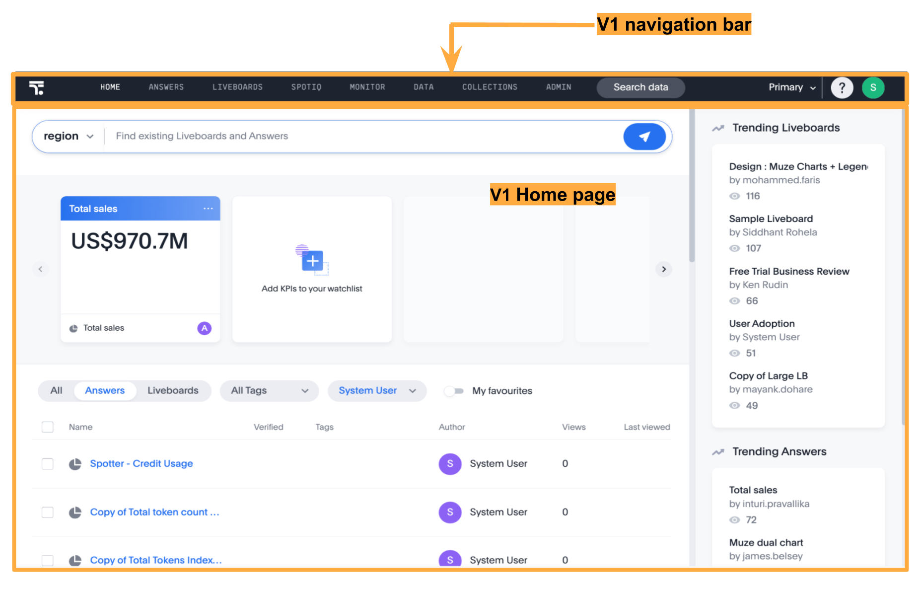
UI experience | Classic layout Includes a standard top navigation, pages without a left navigation panel, and a static home page with limited customization options. | Improved look and feel Includes a modular home page with customizable components, an application selector menu, and a left navigation panel for each application context. | Modern look and feel Includes a left navigation panel that dynamically adjusts its menu based on context and a modular home page with enhanced visual elements and customizable components. |
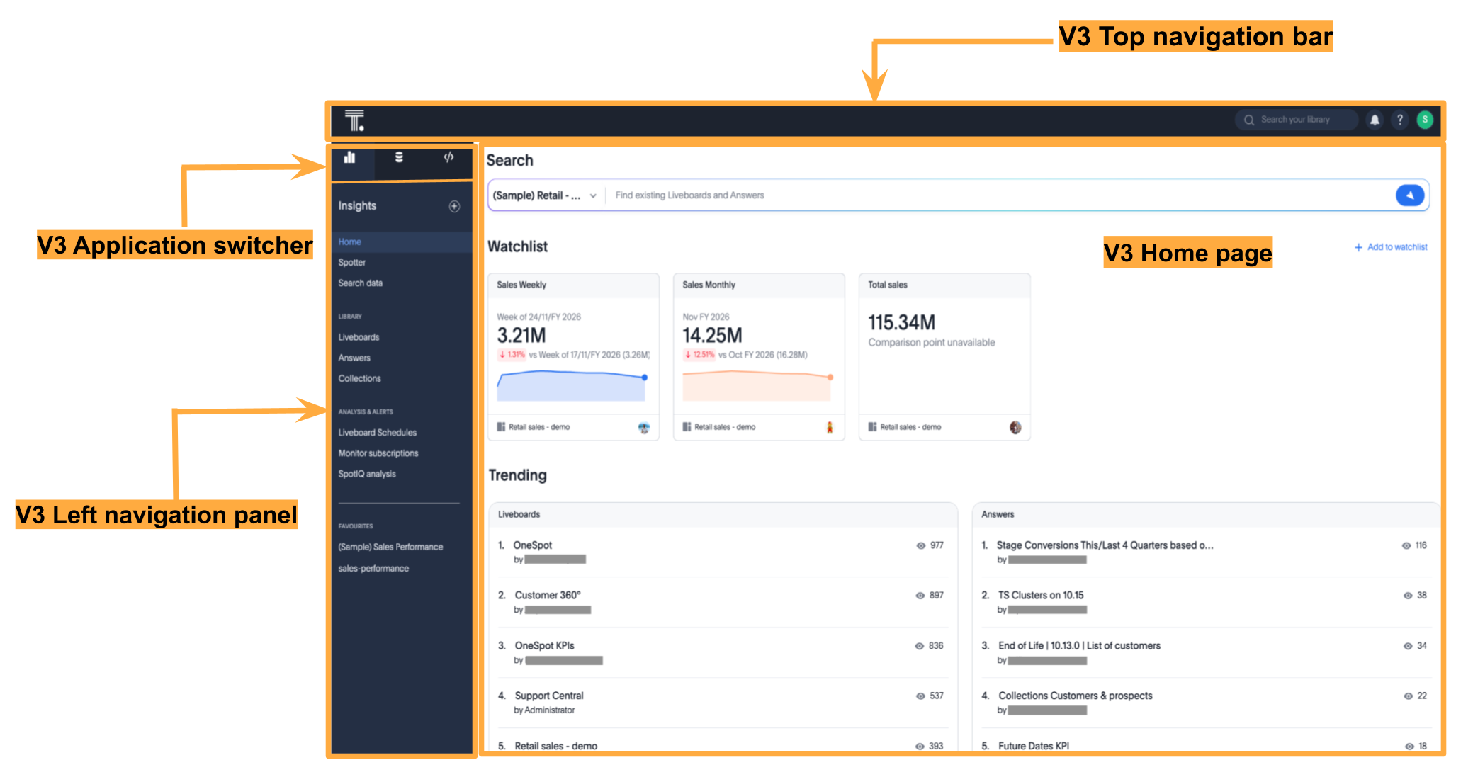
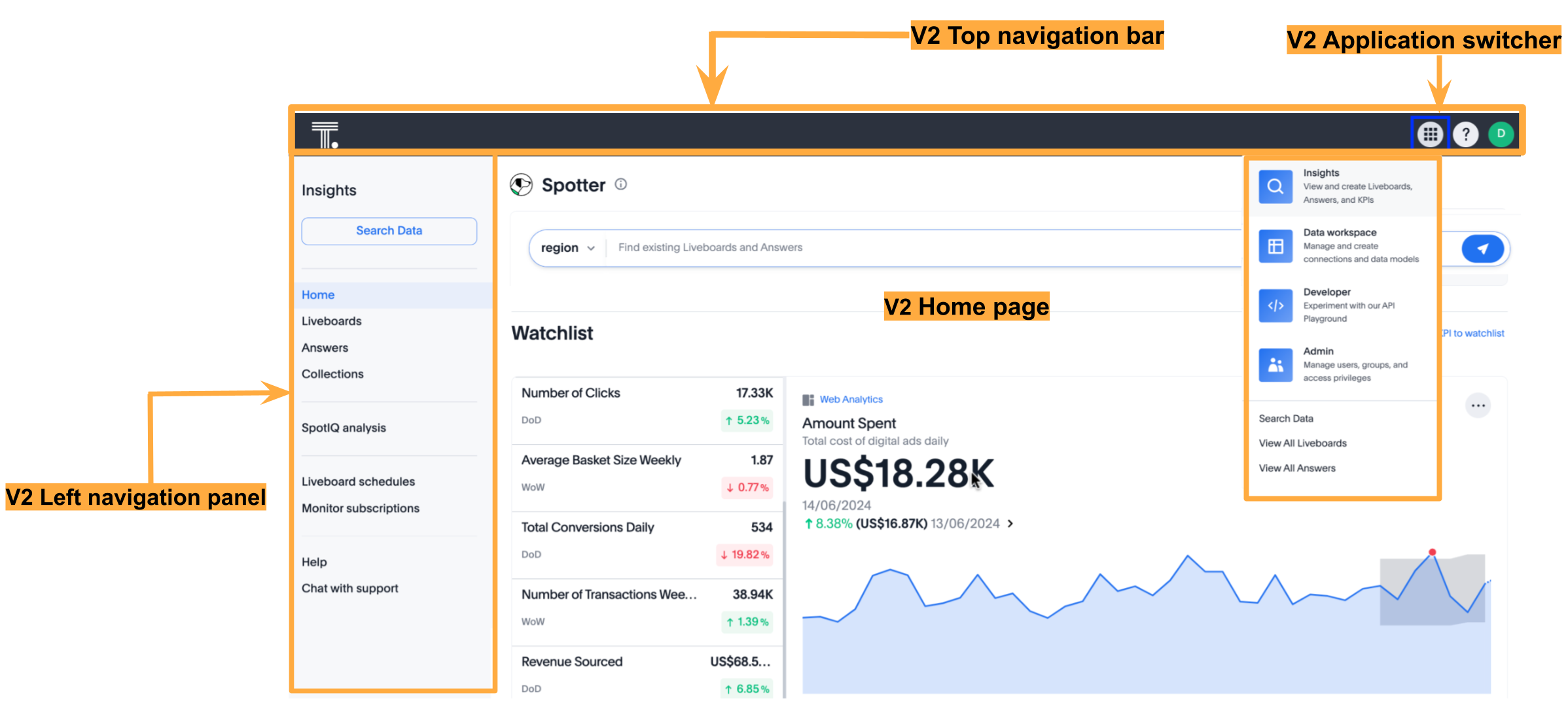
Navigation experience | Top navigation includes the application menu. | Redesigned top navigation bar with an app selector and other icons | Sliding left navigation panel with persona-based application icons |
Home page experience | Static home page with limited customization control | Modular home page with customizable components | Modular home page with customizable components, enhanced styling, and visual elements. [NOTE] ==== The SDK also supports a V4 focused home page experience Early Access. For more information, see Enable the V4 focused home page experience. ==== |
Feature availability | Enabled by default | Disabled by default | Disabled by default |
Customize full application embedding
The Visual Embed SDK provides several controls to customize the embedded view, including setting the default landing page, navigation style, visibility of modules and menu items, and more.
|
Important
|
The classic (V1) experience and V2 experience modes will be deprecated in an upcoming release in 2026. Therefore, ThoughtSpot recommends upgrading the UI experience of your full application embedding to the V3 experience. |
UI experience modes🔗
ThoughtSpot application supports the following UI experience modes:
-
V3 navigation and home page experience (Recommended)
-
Classic (V1) experience (Default experience)
The key differences between these UI experience modes are listed in the following table:
V3 navigation and home page experience
V2 navigation and home page experience
V1 Classic experience
Customize the embedded application UI for your users🔗
Before updating the UI experience, review the key features, limitations, and available SDK controls for customizing navigation and the home page.
For more information about the layout and UI elements in the V3 experience, refer to the ThoughtSpot Product Documentation.
Upgrade to the V3 experience🔗
If you are using the classic (V1) experience in your embed, ThoughtSpot recommends migrating directly to the V3 experience for an improved user interface, enhanced home page customization options, and navigation controls.
Before you begin:
-
Verify if your ThoughtSpot instance has the V3 experience enabled at the cluster level.
-
Ensure that your embedding environment has the latest version of the Visual Embed SDK. The minimum supported version for the V3 experience is v1.40.0.
-
If you are using direct CSS selectors for style customization, test your customization in the Playground.
-
If your embed uses action customization and the SDK events for app interactions, test your customizations for compatibility across different UI experiences to ensure seamless migration.
V3 experience settings in the SDK🔗
To enable the V3 experience, you must use the discoveryExperience object in the SDK. This object supports the following properties:
-
primaryNavbarVersion
Enables the V3 experience. The valid value isPrimaryNavbarVersion.Sliding. -
homePage
Enables the modular or focused home page experience. Valid values include:-
HomePage.ModularWithStylingChanges(Recommended for V3)
Enables the V3 modular home page experience. You must includeprimaryNavbarVersionto update the UI experience to the V3 home page. -
HomePage.FocusedEarly Access Enables the V4 focused home page experience, which consolidates the Watchlist and Recents sections into a single, focused view. -
HomePage.Modular
Enables the modular home page experience with customizable components. This experience does not include the styling options and visual changes available with the full V3 experience. We do not recommend using this option, as it will be deprecated in an upcoming release.
-
|
Important
|
For information about these configuration combinations and their effects, see UI customization options and resulting experience. |
Upgrade from classic (V1) experience to V3 experience🔗
To enable the V3 experience, set the primaryNavbarVersion and homePage parameters in the discoveryExperience object as shown in the following example.
Note that these attributes use the values from the PrimaryNavbarVersion and HomePage enumerations.
// Import required components and enums for V3 experience
import {
    AppEmbed, // Main class to embed the full ThoughtSpot app
    HomePage, // Enum for home page experience settings
    PrimaryNavbarVersion // Enum for V3 navigation experience
} from '@thoughtspot/visual-embed-sdk';

const embed = new AppEmbed("#embed", {
    // Enable V3 navigation and home page experience
    discoveryExperience: {
        primaryNavbarVersion: PrimaryNavbarVersion.Sliding, // Enable V3 navigation
        homePage: HomePage.ModularWithStylingChanges, // Enable V3 home page experience
    },
    // Show navigation panels
    showPrimaryNavbar: true,
    //... other embed view configuration attributes
});
Upgrade from the V2 experience to V3 experience🔗
Both V2 and V3 experience modes support a modular home page with customizable components. The V3 modular home page experience includes additional improvements to the Watchlist, Trending, Learning, and Favorites panels.
To upgrade your UI to the V3 experience, set homePage to HomePage.ModularWithStylingChanges:
// Import required components and enums for V3 experience
import {
    AppEmbed, // Main class to embed the full ThoughtSpot app
    HomePage, // Enum for home page experience settings
    PrimaryNavbarVersion // Enum for V3 navigation experience
} from '@thoughtspot/visual-embed-sdk';

const embed = new AppEmbed("#embed", {
    // Enable V3 navigation and home page experience
    discoveryExperience: {
        primaryNavbarVersion: PrimaryNavbarVersion.Sliding, // Enable V3 navigation experience
        homePage: HomePage.ModularWithStylingChanges, // Enable V3 modular home page
    },
    // Show navigation panels
    showPrimaryNavbar: true,
    //... other embed view configuration attributes
});
Enable the V4 focused home page experience🔗
The V4 focused home page experience is available with Visual Embed SDK v1.50.0 and ThoughtSpot Cloud 26.7.0.cl. This experience consolidates the Watchlist and Recents sections into a unified, focused view designed to surface the most relevant content for users.
|
Important
|
The focused home page experience is an Early Access feature and is disabled by default. To enable this feature, contact your ThoughtSpot administrator. |
To enable the V4 focused home page, set homePage to HomePage.Focused in the discoveryExperience object:
// Import required components and enums
import {
    AppEmbed,
    HomePage, // Enum for home page experience settings
    PrimaryNavbarVersion // Enum for V3 navigation experience
} from '@thoughtspot/visual-embed-sdk';

const embed = new AppEmbed("#embed", {
    discoveryExperience: {
        primaryNavbarVersion: PrimaryNavbarVersion.Sliding, // Enable V3 navigation experience
        homePage: HomePage.Focused, // Enable V4 focused home page experience
    },
    showPrimaryNavbar: true,
    //... other embed view configuration attributes
});
Post migration checks🔗
After you enable the V3 experience:
-
Ensure the UI shows the V3 navigation and home page.
-
Verify that all the customization settings are applied correctly.
-
If you have set up custom routes for navigation within your embedded app, verify navigation workflows and check for breaking changes.
UI customization options and resulting experience🔗
The following table summarizes the resulting UI experience for different configuration combinations:
discoveryExperience setting | modularHomeExperience state | Resulting UI experience |
|---|---|---|
|
| V3 navigation and V3 modular home page |
|
| V3 navigation and V4 home page experience |
|
| V3 navigation and a modular home page that is similar to the V2 experience |
|
| V3 navigation and a modular home page that is similar to the V2 experience |
|
| V2 navigation and V2 modular home page |
|
| V2 navigation and V2 modular home page |
|
| Classic (V1) experience. |
Not set |
| V2 navigation and V2 modular home page |
Not set |
| Classic (V1) experience |
|
| V3 navigation and V4 home page experience |
Customize navigation experience🔗
For information about the navigation elements in each UI experience mode and the related customization settings in the SDK, see Customize navigation experience.
Customize home page experience🔗
For information about the home page components and the related customization settings in the SDK, see Customize home page experience.
Customize the default loading page and navigation routes🔗
In full application embedding, the home page is set as the default landing page when the embedded app loads. You can customize the default landing page settings using the pageId or path attribute.
Customize list page experience🔗
A list page in ThoughtSpot refers to a page that displays a list of objects, such as Answers, Liveboards, and Liveboard schedules. The list pages include columns for sorting, filtering, tagging, sharing, or deleting objects.
List layouts🔗
If your embed has the V3 navigation and homepage experience enabled, the ListPage v3 experience will be enabled by default.
The list layouts in full app embedding typically include columns such as Name, Author, Favorites, Tags, Last Viewed and more. For Liveboard lists, a Verified column is available to filter the list by verified objects. In addition to these columns, the ListPage v3 experience includes the Views column and the following enhancements:
-
Sorting options for Name, Author, and Views columns.
-
Filter addition by clicking the column header without opening the filter modal. This option is available for Favorites, Views columns, and Verified columns.
Include or exclude columns from list layouts🔗
To customize the columns in list pages such as Liveboards and Answers, use the hiddenListColumns attribute with the following List page IDs:
-
ListPageColumns.Authorto show or hide the Author column. -
ListPageColumns.DateSortto show or hide the Last modified column. -
ListPageColumns.Favoritesto show or hide the Favorites column. -
ListPageColumns.Shareto show or hide the Share links in the column. -
ListPageColumns.Tagsto show or hide the Tags column. -
ListPageColumns.Verifiedto show or hide the Verified column in Liveboard lists.
The following example hides specific columns using the hiddenListColumns array:
import {
    AppEmbed, // Main class to embed the full ThoughtSpot app
    ListPageColumns // Enum for columns on list pages
} from '@thoughtspot/visual-embed-sdk';

const embed = new AppEmbed("#embed", {
    // hide Author, Share, and Tags columns on Answers and Liveboards listing pages
    hiddenListColumns: [
        ListPageColumns.Author,
        ListPageColumns.Share
    ],
    //... other view config attributes

});|
Note
|
The |
Additional customization controls🔗
CSS customization allows overriding default styles in ThoughtSpot application pages. You can also use Theme Builder to explore the available CSS variables.
If there is a page element you cannot hide using ThoughtSpot or Visual Embed SDK options, you can use a CSS selector to target the element and apply CSS properties such as display: none;, visibility: hidden;, or height: 0px to hide it from the UI. To find the appropriate selector, use your browser’s Inspect tool to examine the style element in the Elements section of the browser’s Developer Tools.
.bk-data-scope .left-pane .header-lt {
  display: none !important;
  visibility: hidden !important;
}
An example of using direct selectors in a file is available in the complete.css sample on the ThoughtSpot GitHub repository.
You can also declare direct selectors using the rules property in the Visual Embed SDK configuration. This is useful for real-time testing, especially in the Visual Embed SDK playground. Note the required format for encoding CSS rules as JavaScript objects.