Quick Start
This page shows how to create your first visualization using Muze in ThoughtSpot's in-browser editor. We'll walk through each step so you can see exactly how a visualization is built.
Open the Viz Editor
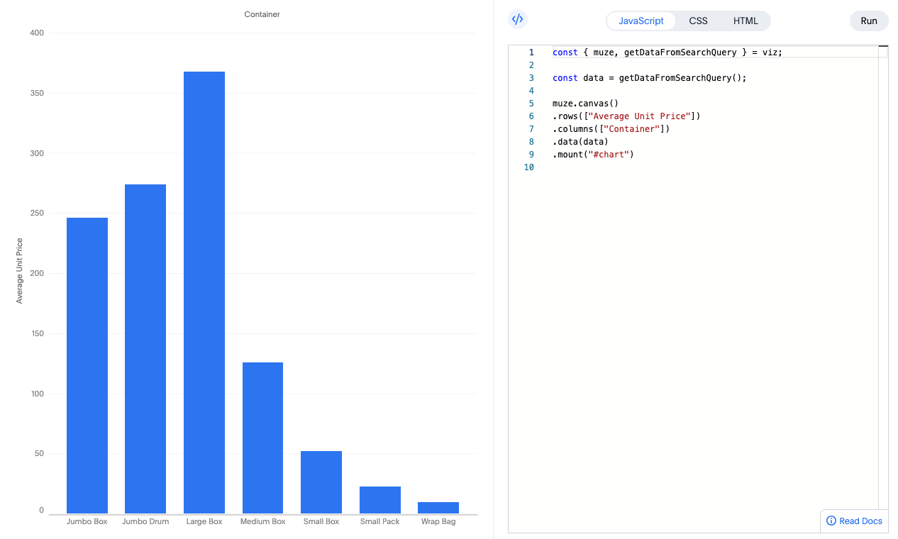
From any search in ThoughtSpot, click Viz Editor in the Visualizations panel. The editor loads a default Muze example.
Click the </> icon at the top-right to reveal the code editor (HTML, CSS, JS tabs). The displayed chart now collapses into a Preview Pane to the left.
Define the HTML
In the HTML tab, you'll see something like:
<div id="chart"></div>
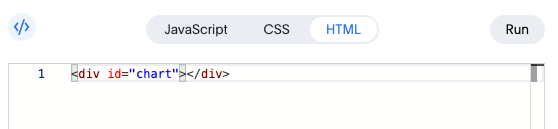
This <div> is where Muze mounts the visualization. Need multiple charts? Just add more container elements.
Style with CSS
In the CSS tab, you can style the container:
#chart {
  width: 600px;
  height: 400px;
}
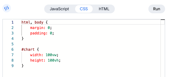
Adjust these or add new CSS rules as desired.
Load & Inspect Data in JS
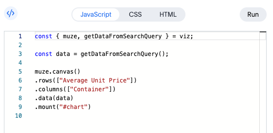
In the JavaScript tab, the viz object provides two main things:
muze: The Muze visualization library instancegetDataFromSearchQuery: Fetches data from the ThoughtSpot search query as a DataModel instance
const { muze, getDataFromSearchQuery } = viz;
const data = getDataFromSearchQuery();

// Inspect the data in the browser console:
console.log(data.getData());
Here's a quick overview of the data we are working with:
| Container | Region | Average Unit Price |
|---|---|---|
| Large Box | Central | 246.36 |
| Small Pack | West | 22.21 |
| Medium Box | West | 153.66 |
| ... | ... | ... |
| Large Box | South | 483.32 |
| Jumbo Drum | South | 250.81 |
| Small Pack | East | 23.47 |
Create a Simple Chart
Muze has a chainable API to declaratively define the visualization. Here's a breakdown of the code you see in the JS tab.
muze
  .canvas()
  .data(data) // Attach the data from the ThoughtSpot search query
  .rows(["Average Unit Price"]) // Y-axis field
  .columns(["Container"]) // X-axis field
  .mount("#chart"); // Attach to our <div>
Bonus: Faceting
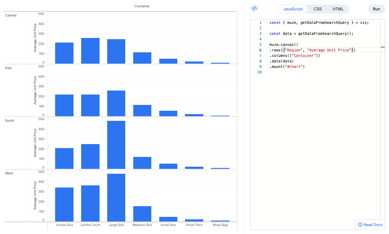
Want to break down the chart by another dimension (e.g., Region)? Add that field to rows or columns and click Run:
muze
  .canvas()
  .data(data)
  // highlight-next-line
  .rows(["Region", "Average Unit Price"])
  .columns(["Container"])
  .mount("#chart");
Save Your Visualization
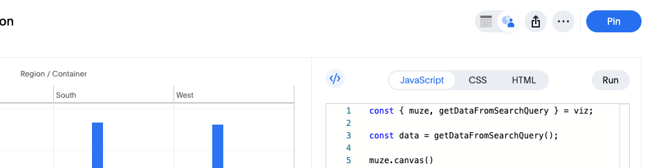
Click Pin above the chart to save it to a Liveboard. Now it's shareable and easily revisitable from the liveboard!
See More
-
Check out our docs on Muze for more configuration options and advanced use-cases:
-
Looking to manipulate your data before visualizing it? Check out our DataModel docs:
You can always come back here by clicking Read Docs again or visit our advanced guides. Enjoy exploring what Muze can do!